Most “best brand identity examples” articles are just Pinterest boards with captions. They show pretty logos and call it analysis. They miss what actually makes brand identity work — the systems behind the visuals, the strategy driving the design, the consistency that creates customer loyalty over years.
I’ve spent fifteen years building visual identity systems for companies like Shell, Nokia, ThermoFisher, and Bed Bath & Beyond. This post breaks down 25 brand identity examples that work — across tech, consumer, retail, service, and trade industries — with honest analysis of why each one succeeds.
The goal isn’t to make you copy these brands. It’s to help you understand what real brand identity looks like in practice so you can recognize it (or its absence) in your own business.
For the foundational concepts, read our cornerstone guide: What Brand Identity Actually Means in 2026.
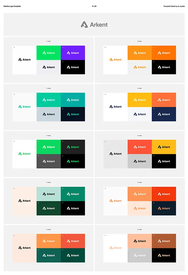
How We Selected These 25 Examples
For each brand, we evaluated:
- Distinctive visual identity that doesn’t look like competitors
- System consistency across all customer touchpoints
- Strategic foundation behind design decisions
- Customer loyalty signals (recognition, retention, recommendation)
- Brand application quality beyond the logo
These aren’t necessarily the world’s most expensive brand identity projects. They’re the ones doing the most work for the businesses behind them.
Tech & SaaS Brand Identity Examples (1-5)
1. Mailchimp
Mailchimp’s identity is one of the most distinctive in B2B software. The mascot (Freddie the chimp) breaks every “serious B2B” convention — and that’s exactly why it works. The hand-drawn aesthetic, warm yellows, and conversational voice signal “we make this hard thing accessible.” Their 2018 rebrand by Collins doubled down on this positioning, creating an identity that’s instantly recognizable in a category dominated by sterile corporate blue.
Why it works: Mailchimp’s identity makes a deliberate choice to be friendly in a category that defaults to formal. The system extends across illustration style, voice, and even error messages.
2. Notion
Notion’s identity is master-class minimalism. The simple emoji-style logo, the muted color palette, the elegant typography — every element signals “thoughtful, calm, organized.” The brand makes a clear visual argument: this is software for people who care about how things look.
Why it works: Notion’s restraint is the message. In a category of loud, gradient-heavy SaaS branding, Notion’s quiet identity stands out by refusing to compete on volume.
3. Linear
Linear’s identity is the gold standard for modern developer-focused SaaS. Deep blacks, electric blue accents, monospace typography, and obsessive design detail throughout. Every pixel signals “this software is built by people who understand craft.”
Why it works: Linear’s identity targets a specific buyer (engineers and design-minded teams) and refuses to dilute the aesthetic to appeal to broader audiences. The narrow positioning is the strategy.
4. Figma
Figma’s identity uses bright primary colors and playful geometric shapes that signal “design tool for everyone, not just specialists.” The brand work by Pentagram established a visual language that scales from product UI to marketing materials to physical events seamlessly.
Why it works: Figma’s identity is genuinely democratic — it doesn’t feel exclusive or intimidating like older design tools (Adobe, Sketch). The visual system extends the product’s accessibility message.
5. Vercel
Vercel’s identity is pure modern luxury: black backgrounds, white triangle logo, geometric clarity throughout. The brand signals premium technical sophistication without any of the typical “developer tool” tropes (terminal aesthetics, code snippets as decoration).
Why it works: Vercel positions deployment as design infrastructure. The identity treats the developer audience as design-literate professionals, not commodity engineering buyers.
Consumer & Lifestyle Brand Identity Examples (6-10)
6. Liquid Death
Liquid Death sells water in tall boy cans. The brand identity is the entire business model. Heavy metal aesthetics, “murder your thirst” tagline, tall boy cans that signal beer-not-water — every visual decision creates the contrarian positioning that lets them charge premium prices for what’s literally water.
Why it works: Liquid Death proves that distinctive brand identity can build a billion-dollar business in commodity categories. The visual identity does 80% of the marketing.
7. Patagonia
Patagonia’s identity is built on understated environmentalism. Earth tones, mountain imagery, simple sans-serif typography. The brand signals authenticity in a category (outdoor apparel) where competitors lean on dramatic photography and aspirational lifestyle.
Why it works: Patagonia’s restraint and consistency over 50+ years has built brand equity that competitors can’t replicate with marketing spend. The identity supports the substance of the company’s positioning.
8. Glossier
Glossier’s pink-and-cream identity reinvented beauty branding in the 2010s. The minimal aesthetic, conversational voice, and obsessive product photography signaled “this is beauty for the Instagram generation.” The identity worked so well that the entire DTC beauty category copied it.
Why it works: Glossier’s identity was timing — perfectly tuned to mobile-first social discovery. The brand became a visual shorthand for “modern beauty.”
9. Oatly
Oatly’s identity is willfully weird — handwritten typography, awkward illustrations, copy that argues with itself on packaging. In a category (alt-milk) where competitors lean clean and clinical, Oatly’s chaotic identity stands out aggressively.
Why it works: Oatly’s brand identity makes the product feel like it has a personality. The packaging itself is a marketing channel, generating earned media and social shares.
10. Allbirds
Allbirds’ identity uses natural materials photography, sustainable language, and a clean sans-serif aesthetic that signals “thoughtful consumer” without screaming “organic.” The brand visual system extends to packaging, retail design, and even shoe care instructions.
Why it works: Allbirds built a brand identity that justified premium pricing for sneakers in a market dominated by Nike and Adidas. The identity is the differentiation.
Service & B2B Brand Identity Examples (11-15)
11. Stripe
Stripe’s identity is the modern reference standard for B2B software branding. Sophisticated color palette, custom illustration system, exceptional typography, and consistent application across every touchpoint — documentation, marketing site, dashboard, emails. The brand identity signals “built for developers who care about craft.”
Why it works: Stripe’s identity has done more for their growth than any single marketing campaign. Developers choose Stripe partly because the brand identity signals competence in the work they care about.
12. Squarespace
Squarespace’s identity is design-forward DIY. The clean typography, sophisticated photography, and minimalist aesthetic position the platform as “the design-conscious choice” versus Wix or GoDaddy. Even their TV commercials use the visual identity as the marketing.
Why it works: Squarespace’s identity does the selling. Customers self-select into the platform because the aesthetic appeals to them — no convincing required.
13. Calendly
Calendly’s identity is purposefully friendly: bright blue, friendly icons, conversational voice. In a category (scheduling software) that could easily feel sterile, Calendly’s identity signals “we make meeting coordination feel easy and human.”
Why it works: Calendly’s identity supports their positioning as the “default easy choice.” The brand makes a complex problem feel solvable.
14. Loom
Loom’s purple, bouncy, friendly identity reinvented video messaging branding. In a category dominated by Zoom’s serious blue and Microsoft Teams’ corporate aesthetic, Loom positioned itself as “video for human communication, not formal meetings.”
Why it works: Loom’s identity makes video feel casual and conversational — exactly the use case the product enables. The brand and product positioning are inseparable.
15. Riverside
Riverside’s identity in podcasting software shows how sophisticated B2B branding works for creators. Deep blues, polished typography, and high-end audio aesthetics throughout. The brand signals “professional-grade tool for serious creators.”
Why it works: Riverside competes against free alternatives (Zoom, StreamYard) by making premium positioning visible through brand identity alone.
Retail & DTC Brand Identity Examples (16-20)
16. Warby Parker
Warby Parker’s identity invented modern DTC branding. Library aesthetics, custom typography, monochromatic photography — the brand signaled “intellectual, design-conscious eyewear” in a category dominated by Luxottica’s mall stores. The identity made $95 glasses feel like a sophisticated choice.
Why it works: Warby Parker’s brand identity created the entire DTC playbook other startups copied. The visual system signals values and personality before customers see the product.
17. Casper
Casper’s blue-and-white identity made mattress shopping feel modern. Friendly illustrations, conversational copy, and clean typography contrasted with the gaudy mattress store aesthetics that dominated the category. The brand identity was a competitive moat for years.
Why it works: Casper’s identity built a brand customers actually wanted to be associated with — rare in commodity categories.
18. Away
Away’s travel-conscious identity signaled “sophisticated traveler” with sage greens, terracotta accents, and aspirational photography. The visual system extended across product design, retail stores, packaging, and content marketing into a cohesive lifestyle brand.
Why it works: Away built a luggage brand into a lifestyle brand through consistent identity application across every touchpoint.
19. Aesop
Aesop’s identity is the pinnacle of restrained luxury in personal care. Amber bottles, clinical typography, apothecary-inspired packaging — every detail signals premium positioning. The brand has held this identity nearly unchanged for 35+ years.
Why it works: Aesop’s consistency over decades has built brand equity that competitors can’t replicate even with massive marketing budgets. The restraint is the moat.
20. Goop
Goop’s identity is aspirational lifestyle distilled to visual essence. Cream backgrounds, serif typography, expensive photography, and sophisticated layout choices throughout. The brand identity does much of the work of justifying premium pricing on otherwise commodity products.
Why it works: Goop’s identity creates the perception of premium curation — a real business asset built entirely through visual brand identity.
Trade & Contractor Brand Identity Examples (21-25)
21. Mr. Handyman (National Franchise)
Mr. Handyman’s identity (red, white, and blue with the distinctive “Mr.” prefix) is one of the few contractor brands with genuine national recognition. The franchise system enforces brand consistency across trucks, uniforms, marketing materials, and customer touchpoints in every market.
Why it works: Mr. Handyman’s brand identity allows them to charge 20-30% premium over solo handymen by signaling reliability through brand recognition. The visual consistency is the trust signal.
22. Service Champions (HVAC)
Service Champions’ identity (red and yellow, championship badge aesthetic) communicates “premium HVAC company that wins awards.” The visual system extends from trucks to uniforms to customer service scripts. They consistently rank among the most successful residential HVAC companies in California.
Why it works: The “championship” brand positioning supports premium pricing in a category most consumers commoditize. The identity earns the premium positioning.
23. Roto-Rooter (Plumbing)
Roto-Rooter’s identity has nearly 90 years of brand equity. The distinctive logo, jingle, and visual consistency across thousands of franchised locations creates instant recognition. The brand commands a premium in emergency plumbing largely because of brand identity, not service differentiation.
Why it works: Roto-Rooter proves the compounding value of brand identity over decades. New plumbing competitors can’t catch the brand equity Roto-Rooter has accumulated through consistency.
24. Mister Sparky (Electrical)
Mister Sparky’s identity (yellow lightning bolt, friendly mascot, “America’s On-Time Electrician” tagline) creates differentiation in a category most consumers treat as commodity. The franchise enforces strict brand consistency that allows individual operators to benefit from collective brand equity.
Why it works: Mister Sparky’s identity solves the trust problem inherent in electrical work — homeowners pay premium prices because the brand signals safety and reliability.
25. The Plumber Guy (Independent)
The Plumber Guy represents what happens when an independent plumbing contractor invests in real brand identity. Distinctive logo system, consistent color palette across trucks and uniforms, professional photography of actual technicians at work. Most independent plumbers can’t compete with this level of brand identity sophistication.
Why it works: The Plumber Guy shows that contractor brand identity isn’t limited to franchises. Independent operators who invest in real brand identity can command premium pricing locally.
What These 25 Examples Have in Common
After analyzing 25 brand identity systems across categories, the patterns separating great brand identity from forgettable branding are consistent:
Pattern 1: System Consistency Over Logo Quality
The best brand identities aren’t necessarily the prettiest logos. They’re the most consistently applied systems. Every customer touchpoint reinforces the same visual language.
Pattern 2: Strategic Differentiation From Category Norms
Liquid Death looks like beer. Oatly looks chaotic. Aesop looks like an apothecary. Each brand identity is built around being noticeably different from category competitors — not just slightly better.
Pattern 3: Personality Beyond Aesthetics
The best brand identities have a personality you could describe in words. Mailchimp is friendly. Linear is exacting. Liquid Death is rebellious. Aesop is restrained. The visual identity expresses the personality.
Pattern 4: Brand Application Discipline
These brands don’t just have logos. They have brand systems applied with discipline across every touchpoint — packaging, website, email, customer service, signage, photography. Consistency is the competitive moat.
Pattern 5: Investment Beyond Logo Design
None of these identities were built with $79 Fiverr logos. The companies invested in real brand strategy, real designers, and real systems. The investment compounds for decades.
What’s Missing From Forgettable Brand Identities
The brand identity examples that don’t make these lists tend to share opposite characteristics:
1. Template aesthetics. Visual systems that look like dozens of competitors.
2. Inconsistent application. Different fonts on website vs invoices vs marketing materials.
3. No personality. Generic professional aesthetics that say nothing specific about the business.
4. Logo-only thinking. A logo file with no system supporting it.
5. Cheap execution. $79 templates, AI-generated marks, or DIY brand identities that signal “we didn’t invest here.”
If your current brand identity has three or more of these characteristics, you’re competing with one hand tied behind your back.
How Long These Brand Identities Took to Build
Most of the brand identities on this list weren’t created in a sprint. They evolved over years through:
1. Strategic foundation work (positioning, audience research, competitive analysis) — typically 4-8 weeks before any design started
2. Identity system development (logo system, color, typography, photography direction) — typically 6-12 weeks of design work
3. Brand guidelines documentation — typically 2-4 weeks creating the rules
4. Ongoing application and refinement — years of consistency across every business touchpoint
This is the honest reality. Real brand identity work isn’t a 2-week sprint. It’s a strategic investment with ongoing maintenance. The brands that get this right invest accordingly.
What These Examples Cost (Honest Estimates)
Pricing varies wildly, but based on industry knowledge:
- Mailchimp’s Collins rebrand: Likely $1M+ for the full system
- Notion’s identity: Likely $50K-$200K range for original work
- Stripe’s identity (largely in-house): Multi-millions over years
- Mr. Handyman / Roto-Rooter franchise identity: Multi-millions accumulated over decades
- Independent contractor brand identity: $5,000-$25,000 for productized agencies
For most growing businesses, $5,000-$25,000 is the realistic range for serious brand identity work that delivers business outcomes comparable to these examples (at smaller scale).
How to Apply These Lessons to Your Business
You’re not building Mailchimp. You’re building your business. But the principles transfer:
1. Invest in strategic foundation first. Don’t start designing until positioning is clear.
2. Build a system, not just a logo. Color, typography, photography direction, voice — all of it.
3. Apply consistently. Every customer touchpoint should reinforce the brand identity.
4. Be willing to be different from competitors. Sameness is invisibility.
5. Document and maintain. Brand guidelines aren’t optional. They prevent the gradual erosion that destroys brand consistency.
6. Invest appropriately for your stage. $5K-$15K for productized brand identity is realistic for businesses doing $500K+ revenue. Below that, get a productized logo and revisit branding when ready.
Want to Upgrade From Templates to Real HVAC Design + Branding?
If your NYC HVAC business is ready to graduate from templates, you have two options:
Option 1: Custom HVAC Website Design ($900 flat, 5 days)
We build custom NYC-focused HVAC websites for $900 flat, in 5 business days. Pre-war positioning, DOB permit handling, NY Clean Heat rebate pages, borough-specific service areas, transparent pricing — all built in. You own everything.
→ Learn about our HVAC website design service
Option 2: Full Brand Identity + Website ($5,000-$15,000)
For HVAC contractors ready to scale into agency-level operations, we build complete brand identity systems: logo, color system, typography, photography direction, voice and messaging, brand applications across trucks/uniforms/marketing materials — applied to a custom website that performs locally.
Same design team that’s built brand identity for Shell, Nokia, ThermoFisher, and Bed Bath & Beyond — applied to NYC HVAC contractors at NYC-realistic prices.
: There’s no single “best” brand identity example — strong brand identity depends on category fit, audience alignment, and business outcomes. Mailchimp’s friendly approachability works for SaaS. Liquid Death’s rebellion works for beverages. Aesop’s restraint works for luxury personal care. The best brand identity is the one that distinctively represents your specific business in your specific market. Trying to copy a famous brand identity rarely works because the strategy underneath isn’t transferable.
Five consistent patterns separate successful brand identity examples from forgettable ones: system consistency across every customer touchpoint, strategic differentiation from category competitors, personality beyond aesthetics, disciplined brand application over years, and investment beyond logo design. Pretty logos don’t make brand identity successful. Coordinated systems applied consistently do.
The strongest SaaS brand identity examples in 2026 include Mailchimp (friendly approachability), Linear (exacting minimalism), Notion (calm sophistication), Figma (democratic design), Vercel (premium technical), and Stripe (developer craft). Each of these brands built distinctive visual identity systems that differentiate them from generic blue-and-white SaaS competitors. The patterns: restraint, consistency, and visual systems that signal what kind of software they make.
The most influential DTC brand identity examples include Warby Parker (intellectual eyewear), Casper (modern mattress), Glossier (Instagram-era beauty), Allbirds (sustainable footwear), Away (sophisticated travel), and Aesop (restrained luxury). These brands proved that distinctive visual identity could justify premium pricing in commodity categories. The pattern: build brand identity strong enough that customers want to be associated with it.
Small businesses don’t need million-dollar brand identity work, but they do need strategic distinctiveness. Successful small business brand identity examples typically include: a custom logo (not a $79 template), a defined color palette of 2-3 brand colors, consistent typography choices, real photography of the business, and brand application across website, social media, and physical materials. The total investment for productized small business brand identity typically runs $1,500-$5,000 in 2026.
The strongest contractor brand identity examples in 2026 include Mr. Handyman (national handyman franchise), Service Champions (HVAC), Roto-Rooter (plumbing), Mister Sparky (electrical), and The Plumber Guy (independent plumbing). These brands prove that contractor brand identity drives premium pricing power. The pattern: consistent visual identity across trucks, uniforms, marketing, and customer touchpoints that builds trust before customers see the work.
Strong logo design examples in 2026 include Mailchimp’s Freddie illustration, Liquid Death’s metal-inspired wordmark, Linear’s geometric minimalism, Notion’s elegant simplicity, and Stripe’s sophisticated wordmark. Each works because the logo extends a complete brand identity system — not because the logo itself is the brand identity. The best logos are easy to recognize, scalable across sizes, and consistent with the broader visual system behind them.
Visual identity is the visual component of brand identity — logo, colors, typography, photography style, layout systems. Brand identity is the complete system including visual identity PLUS brand strategy, voice, messaging, and brand applications. Visual identity is what you see. Brand identity is the strategic system that produces what you see. The terms get used interchangeably, but visual identity is technically a subset of full brand identity.
Restaurant brand identity examples that work include sweetgreen (modern fast-casual minimalism), Cava (Mediterranean lifestyle), Joe Coffee (NYC neighborhood craft), Sqirl (LA artisanal aesthetic), and many independent restaurant brands with strong visual systems. Restaurant brand identity often works through photography style, packaging, signage, and menu design coordination. The category benefits enormously from distinctive visual identity because customer experience starts before the food arrives.
Tech startup brand identity examples worth studying include Linear (exacting minimalism), Figma (democratic design), Notion (calm sophistication), Vercel (premium technical), Loom (friendly purple), and Cal.com (clean B2B). The pattern for successful startup brand identity: differentiate from generic SaaS branding through distinctive aesthetics, restraint, and visual systems that signal what kind of company you’re building. Avoid blue-and-gradient generic SaaS templates.
The best way to find brand identity examples for your specific industry is to research three categories: (1) the established leaders in your industry, (2) the modern challengers disrupting the category, and (3) brands from adjacent industries with similar customer profiles. Document what visual identity choices each makes. Look for patterns. The goal is understanding what works in your category, not copying any single brand. The Brand New blog (UnderConsideration) is the best ongoing source for current brand identity examples across categories.
Famous brand identity failures include the Gap’s 2010 logo redesign (lasted 6 days before reversal), Tropicana’s 2009 packaging redesign (caused 20% sales drop), and many corporate rebrands that abandoned distinctive identity for generic modern aesthetics. The pattern in failed brand identity work: prioritizing trendy aesthetics over established brand equity, ignoring customer recognition signals, and making changes without understanding why the existing identity worked.
Famous brand identity projects vary wildly in cost. Mailchimp’s 2018 Collins rebrand likely cost $1M+ for the full system. Notion’s original identity probably cost $50,000-$200,000. Stripe’s identity (largely developed in-house) represents multi-millions invested over years. Most growing businesses can’t (and shouldn’t) invest at these levels. For productized brand identity that delivers business outcomes at smaller scale, the realistic range in 2026 is $5,000-$25,000 for full identity systems.
No — and trying creates two problems. First, copying makes you a derivative version of the brand you copied (instantly weaker positioning). Second, the strategic foundation underneath someone else’s brand identity doesn’t transfer to your business. What works for Liquid Death’s rebellious beverage positioning won’t work for a B2B software company. Study brand identity examples to understand the principles. Apply those principles to your specific business, audience, and category. Distinctive brand identity requires original strategic work.
Real brand identity work typically takes 12-20 weeks to complete: 4-8 weeks of strategy and positioning work, 6-12 weeks of design system development, 2-4 weeks of brand guidelines documentation. Famous brand identity examples like Mailchimp’s redesign took months of design work with multiple revision rounds. The compound brand equity behind brands like Roto-Rooter or Aesop took decades of consistent application. Real brand identity isn’t a sprint — it’s an investment with long-term compounding returns.